Context
This is a recorded lecture in Design Technology, Spring 2025, at the University of Florida with the instructor’s writing adjustments after the class.
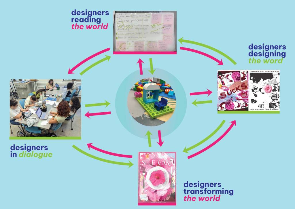
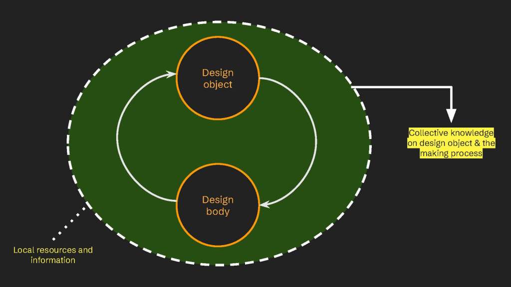
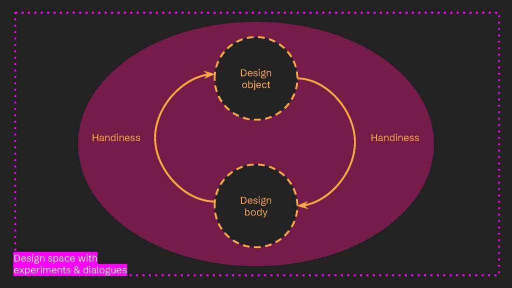
Today, we are going through the relation between the design body and the design objects. Handiness was mentioned briefly in week one if you got a chance to take a look at the transcripts. Thus, I would like to emphasize how we can read the design when looking at its cycle of handiness – the making of design object by the design body from whatever available and not available in the space. Through this, we understand what it means to claim a design object as an epistemic object. What is the role of visual representation in design object? What is represented by the design object, including the people, the activity, and the culture?
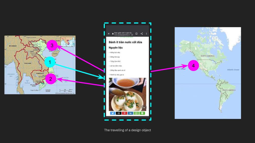
In last week’s lecture, we already got to understand how the form or the visual representation of the design object varies through spaces. It shows that in different contexts, local materials vary – so as the forms and meanings of the design object. And for today, we will just stay in one specific space which is in this local context – the United States – to understand what a specific design object means. This time, the design object is from different cultures, instead of the Christmas tree that has been a part of the Western cultures. The United States is such a diverse country with so many cultures, when it comes to people, cultural materials, and businesses. You can see a vast number of products from different countries in “local” supermarkets such as Walmart and Publix, so as people of many cultures in the shared space in our campus town. This design object is the Vietnamese food that I’m familiar with but quite scarce in the United States – bánh ít trần.
Why do I choose food? We each need and consume food, often 3 meals per day, right? Like everyone with food, I’m familiar with food as an amateur eater, cook, and commenter, which allows me to compare the techniques in cooking food with the design process. Each has a lot of experiments, besides curiosity and eagerness in making and trying something new. The final result is also a dish that is ready for display, photograph, taste, and share, which does have similar aesthetics and functions as a design product. Thus, food can be understood as design.
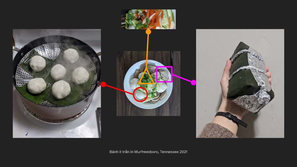
Bánh ít trần means a small bite that is unwrapped by any banana leaves. It is originally from the central Viet Nam, where I got a chance to eat from the south of Viet Nam. And when I moved to the States, I remembered this dish and learned how to remake it with friends for the New Year’s party. The dish was not popular in the States and not always available in a typical restaurant where you can have common dishes such as phở, mì hoành thánh, or chả giò. Inside bánh will be the smooth mung bean paste and savory pork, wrapped in the thin layers of rice flour. It is ready for dining with some garnish besides sour carrots and radish, while on the side is some ground pork chả lụa that is similar to ham in the States. I would not go into details of the meaning of this dish because it is a part of the history of the people in central Viet Nam and now it is explained in the different cultural contexts. To understand a product of culture, we must spend time and labor to understand the history of that culture and its people. It is per the learner’s interest and persistence.
However, since we talk about design as a process, I want to emphasize the food in terms of process. This dish asked for many kinds of ingredients which are not often available locally. Thus, it has to be made freshly with the techniques on condensing, folding, steaming, as well as plating the food with many kinds of garnish and toppings in order to reproduce its complex flavor profile. Many unfamiliar techniques that asked to be done by as many hands as possible! Thus, we accessed the digital recipes through our phones, purchased the local ingredients, made the dish, while revisiting our memories when we ate the dish in our home country. In a way, we were the consumer of a cultural product and then tried to design it from the available materials and techniques that we had.
In a way, the digital phone is the design object that allows us to access the food recipes, while our taste bud and mind is another design object that confirms whether the food recipe allows the dish similar to our memories. The availability and accessibility of design objects, whether it is digital or bodied, allows us to create new things in the United States, when there was not such a thing in the local space in Tennessee. If it were in populated cities of many diverse cultures like in Florida, New York, or California, this dish could have been available in restaurants or markets. However, there were not a lot of Viet communities who demand this dish in Tennessee, so it was absent. Even the banana leaves required to steam bánh ít trần could be sold with a high prize and frozen form in the Asian market in Tennessee. In my hometown in north of Viet Nam, it is available everywhere in the neighborhood and could be asked for free. The food projects the weather conditions and the people of that place, isn’t it?
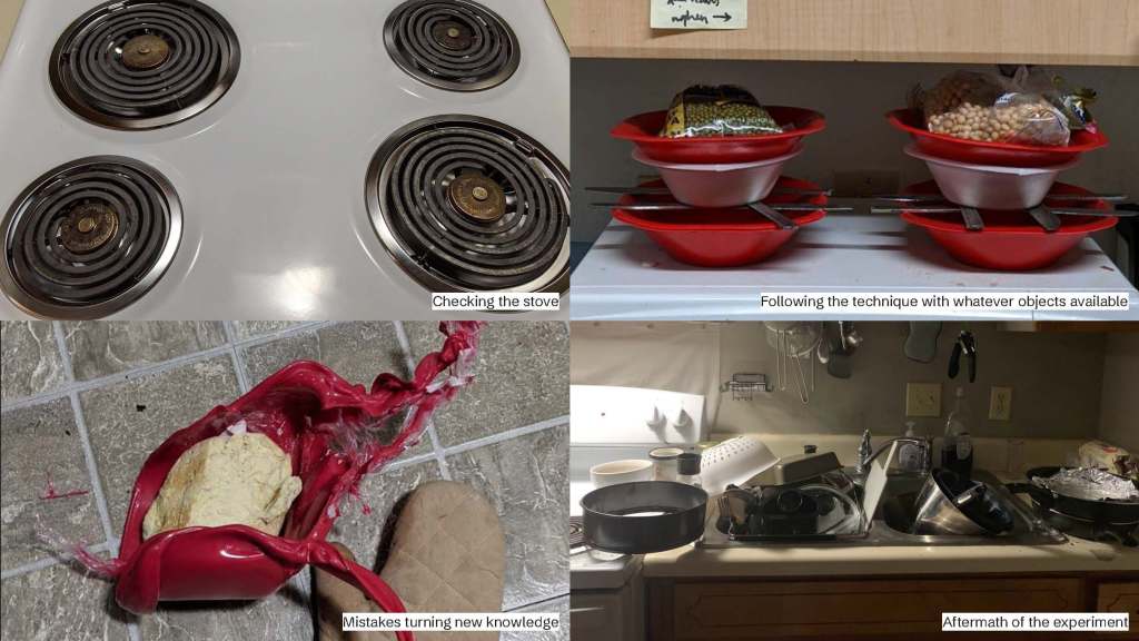
The making process of a cultural product allows the designers to observe and converse. Since the food is not local, we need to check on the available ingredients and cookware in our apartments. And then we sought through the local markets to find the missing ingredients and cookware. There’s a lot of checking back and forth – which is similar to how you followed a recipe from social media. You will go through the design space to check the available objects that you can make a new design object out of what is available. Then, we checked with each other on who had the cooking techniques to produce the dish without wasting them through the experiment process. The constraint of time and materials encouraged the conversations to come to several decisions on who can do what efficiently.
Below are some parts of the design space that we had to occupy, observe, and change for cooking. This includes checking on the digital stove that does not need gas like in our home country, which does not have the actual fire for our cooking style at home. We do not have the presser made of wood, so this is how the pressing technique was created from the plastic wares, metal knives, and extra bean bags as how the pie baking process in the States is. We made a lot of messes during this process, just in the small apartment space that everyone cooked, had party at, and cleaned up. Yet, this process allowed us to understand how difficult the practice of foreign culture could be from the local space that is not dedicated for that. Thus, it is always more time- and money-efficient when consuming and producing based on the available local tools and ingredients.
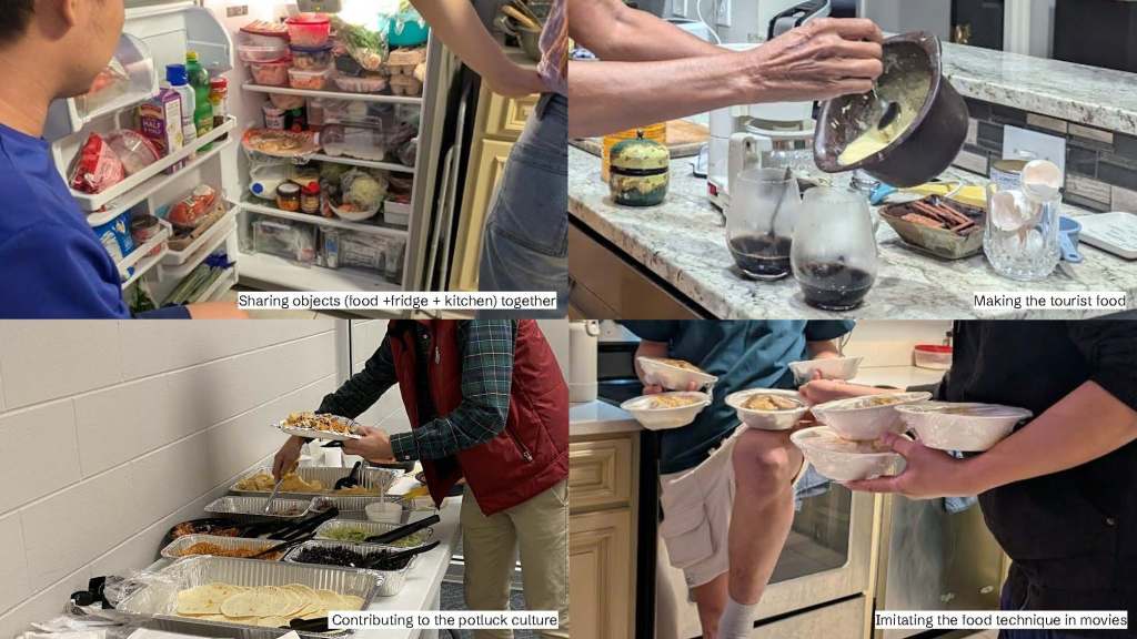
Thus, as a group of Viet friends, we gradually adapted to the United States local cultures. Originally, the food was made among the Vietnamese folks. After that, we moved in with friends from other cultures including Japanese, Indian, and African American, who also went to school in the campus town. Food in cooking, sharing, and eating became a common practice that everyone from different cultures had, committed, and enjoyed. During this process, I talked to people of cuisines other than Vietnamese and expanded my understanding of other cultures from these conversations. Recipes are no longer followed as strictly and stressfully because friends of many cultures were willing to join their hands in helping with certain dishes.
As cultural representations are not followed exactly and meticulously, it was lots of fun in sharing cultures across the group of friends and growing networks. From the hosting culture in Viet Nam where the host will make all the food and joined by their guests, we adapted to the potluck culture locally. It is the communal culture that each person brings a dish to the food party which can be host in a house or working place. This allows the celebration in almost any space, less burden on a specific person, made and shared by everyone. However, when food is shared conveniently and massively by diverse cultures and diverse people, the diners might not need the cultural contexts of the food. Too much information to adopt while we were busy multi-tasking in the party: eating food, talking, watching movies, and singing. The ambience of the potluck party is often celebratory and fun while the cultural historical contexts of food sound lecturing to the partygoers.
Thus, building a community of care and cultural knowledge has been one of my interests in adapting food in graphic design practices. In this case, the shared experiences of making and having food together is embedded in visual representations of cultural products, which align very well to my professional practices in graphic design in brands for small businesses, food packages, and UXUI in customer services. It is the cycle of food where I was initially the diner, the explorer, the taster, the community member, and then the graphic designer in food. Food can be understood as the epistemic object that allows conversation, exploration, reflection, and collaboration. Food is the design object that projects the embodiment and externalization of the designer’s positionality. Thus, I would like to introduce you to the definition of positionality, besides handiness, that I learned from Dr. Frederick van Amstel.
Positionality is the critical reflection on the socio-historical position of the human body, including ancestry, gender, race, class, ethnicity, condition, and handiness.
Dr. Frederick van Amstel, MxD Seminar lecture, 2024
The food making and gathering, which I just showed you, does not necessarily align with the category that my visuals describe – Vietnamese and female. Rather, it shows something much more complicated and more situational: food as a design product of the diverse collective who is willing to adapt to the local cultures while also inheriting and appreciating their cultural origins, along with the digital technologies and globalized food ingredients in the local space. In this case, I want to emphasize this specific picture which was one of the fun moments that we had in the potluck party last winter break. It was when we tried to mimic how the service workers in the local Asian restaurants performed their serving skills. The fun in performing ourselves, however, brought me to the one of the iconic images in a very popular movie, which is Kung Fu Panda series published in the United States! The newest version was recently launched in 2024.
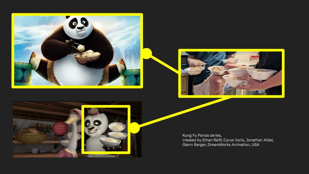
The first film of Kung Fu Panda was launched in 2008 when my primary school host a field trip in the cinema and we watched the movie for the first time, besides Madagascar and High School Musical. It was a fancy field trip host by an international school in Ho Chi Minh city. The movie was so popular that it embedded certain perspectives of martial arts and Chinese cultures to us – the Vietnamese kiddos. The main character, as you could see – Po the panda, is the next generation of martial arts legend who is also the son of the traditional Chinese noodle restaurant. Thus, Po performs his martial art master skills in holding many noodle bowls with his body, just like my friends have performed their skills in the party! Excited with how the media could impact on how we interacted with food, I followed the trace. That was when I saw many movies about martial arts in the Chinese cultural contexts. I am observing this as a Vietnamese in Viet Nam, one of the Asian countries that are impacted by China that was represented by the United States – both are the global power houses.
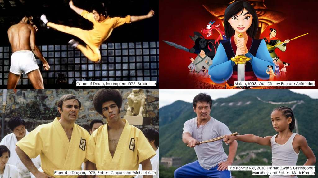
The movies are starred with many actors from China, in the Asian cultural contexts, yet mainly produced by the Western directors, from the United States. The movies were produced and launched in many decades ago, yet portraying the Asian cultures, or more specifically Chinese martial arts culture, from the United Staters’ lenses. If you google these movies, they were so famous and successful at the time, having global impacts beyond the United States. However, the issue here is the misalignments of the design object in visual representation – Chinese culture in the movie – and the positionality of the design body – the Western directors based in the United States. This misalignment risks visual misrepresentations in the design objects, which is conveniently and massively produced through media and products for us to consume. The portrait of Chinese cultures as traditional, mysterious, martial arts is repetitive throughout the movies and somehow mediated through the group activity many decades later.
This portrait is not only described in movies, but also graphic design and arts in our everyday lives, including the local Trader Joe’s in our campus town. From this image, what can you read about the visual representations of the characters in the design board?
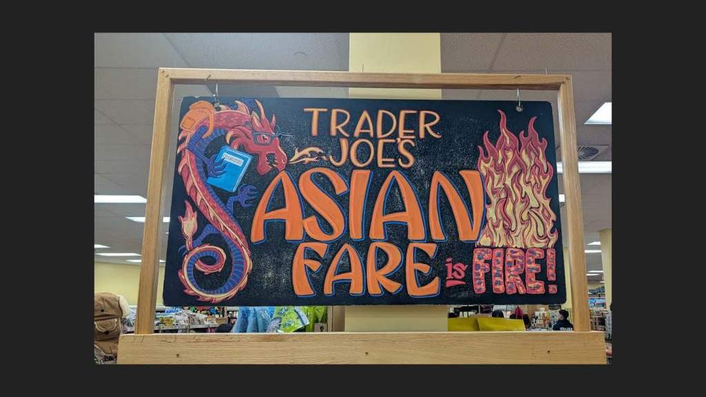
[Student responses on Asian represented with dragon, chemistry book, glasses, and Asian-styled typography]
When we’re paying attention into little details to the graphic design, there’s the common use of warm color palettes such as red and orange, with a touch of blue. There is also the reference of Asian cultures through the martial art creatures – the red dragon that you could see in Mulan – the famous movie series produced by Walt Disney, right? The Western cultures also have dragon as traditional, mysterious cultural representations but it is often green or purple, while the red or yellow dragons are often seen in the Eastern cultures. Also, this dragon is holding a Chemistry book, as you said, wearing glasses, and holding a backpack, which is probably to attract the main audience of this campus town -the student population from many cultures that perform well in the highly ranked university. However, when doing so, the designer or artist was probably not mindful of the risky stereotype that they perpetuated through the visual representations, which aligned well with the movies about Chinese cultures, produced by the United Stater directors.
When I took the photo, I did not ask the staff about the author of visual representations, so the designer was absent from the interactions between the design object and the prospective users. I bet that this visual representation has been seen by many people in the market, because it was very crowded on the day that I took this photo. While many people might have seen it, I have not heard anyone questioning the problematic visual representations. I wanted to emphasize this to remind us all that graphic design is very impactful on the visual aesthetic levels to the subconscious embodiment of stereotypes.
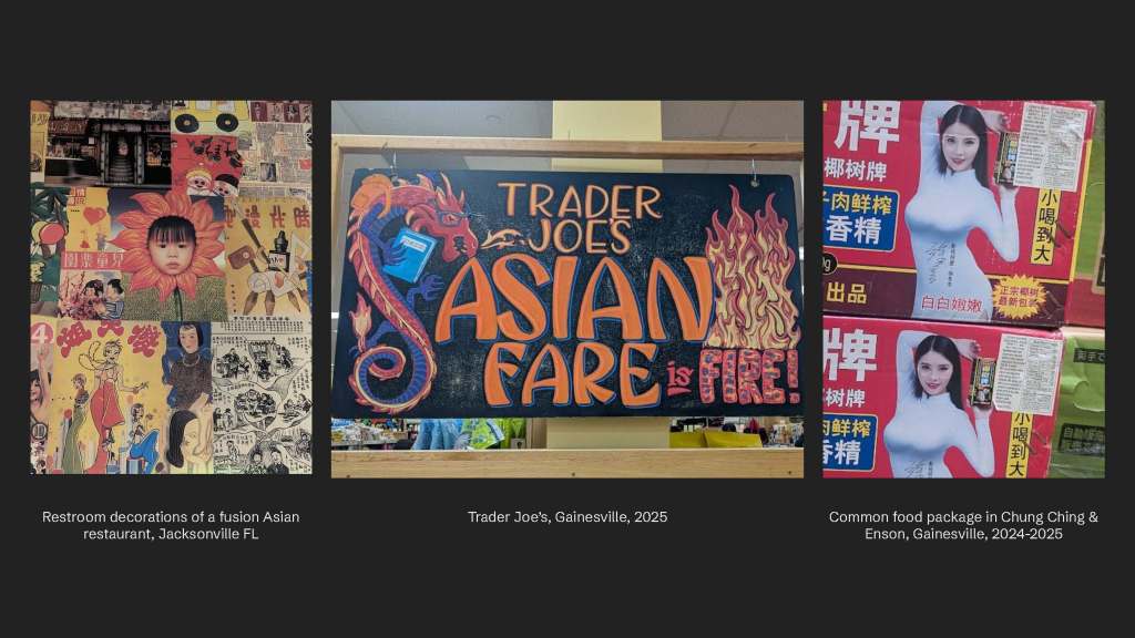
You can also see how the use of warm color palette and old-school looks of Asian representation in other service areas in Florida. In the fusion Asian franchise in Jacksonville, Chinese is the language of the decorations in the restaurant and also in the restroom. This use of language to represent Asian-ness is already the reduction of cultural representations, while the food options varied from Chinese, Korean to Singaporean and Malaysian. It implied that the designer of the restaurant services knew the demand of Asian diversity in food service, yet somehow using one language in reproducing the Asian-ness across spaces. Along with the aesthetic typography and color palette, the female figures have been commonly used in the immersive graphic design. Similar to diverse food that does not have to be authentic but respond well to the demands of the local communities, the aesthetics of graphic design portray the Asian culture as exotic, mysterious, incomprehensible, but not threatening. Thus, the Asian design body in the visual representation is powerless, conquerable, and entertaining.
As graphic designers, we have lots of authority in creativity. We want to evolve from the available design objects that might turn old and become boring to us. But, before doing so, maybe we should question the visual representations in the current design objects and hold dialogues with the represented design body who might give us the cultural contexts of the design object. This allows us to get more in-depth understanding of the relation between the visual representation of the design object, the design object, the design body in such representation, as well as the design body that actually produced the object. These are the common questions that I would like to encourage you to start practicing and applying in the design process, to keep expanding the possibilities of epistemic object that the article suggests.
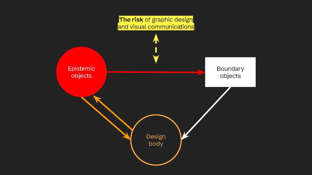
Besides the authority in producing visual representation, we also have access to mass production of such representation, which is guaranteed by industrialization. This is when stereotypes are carried across spaces, consumed, celebrated, and reproduced, per the cycle of handiness. The lack of cultural sensitivity and comprehension is embedded in the industrial, cultural products, per the relation between the design body and the design object. This reflection and critique bring me to another question on design object:
What are alternative ways to project positionality of the design body?
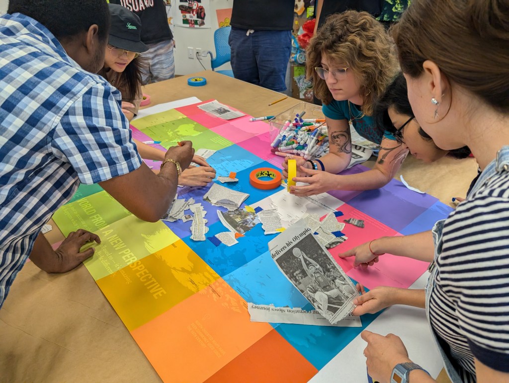
How can I as the design body project the questions as well as critical, provocative thinking in the design object? Among many design experiments, which includes Lego Serious Play already introduced and practiced in our class, I have valued the metaphorical, abstract materials in the design process. This includes the paints in studio arts, the clothes and visual journals that I always brought in the observations, as well as the Trash activity that we will be doing today. Every design object that the design body has selected and consumed across spaces does disclose the positionality of that design body. So, how is the positionality of the design body represented in the design objects? Without questioning it, we risk perpetuating certain misrepresentations without understanding them.
I am Trash activity was introduced to our graduate studio MxD by Dr. Frederick van Amstel in 2024. During this process, similar to you, my colleagues and I gathered trash in one week and crafted self-representations of self as the design body. The abstract representation from trash as the design object was raw and pungent. Later on, I reflected and recognized trash as another phase of the cycle of handiness and that besides being a designer by professional titles, I am also the user and waster of the industrial products. As graphic designers, we usually have the habits of producing beautiful graphics from our laptop, with collaborators, in the design studio, right? It will be quite similar when you get a part-time job or full-time job in graphic design, art direction, or advertising. However, those graphics will eventually become waste – the destructive wastes to our planet as the shared design space – unless it is recycled and reused properly.
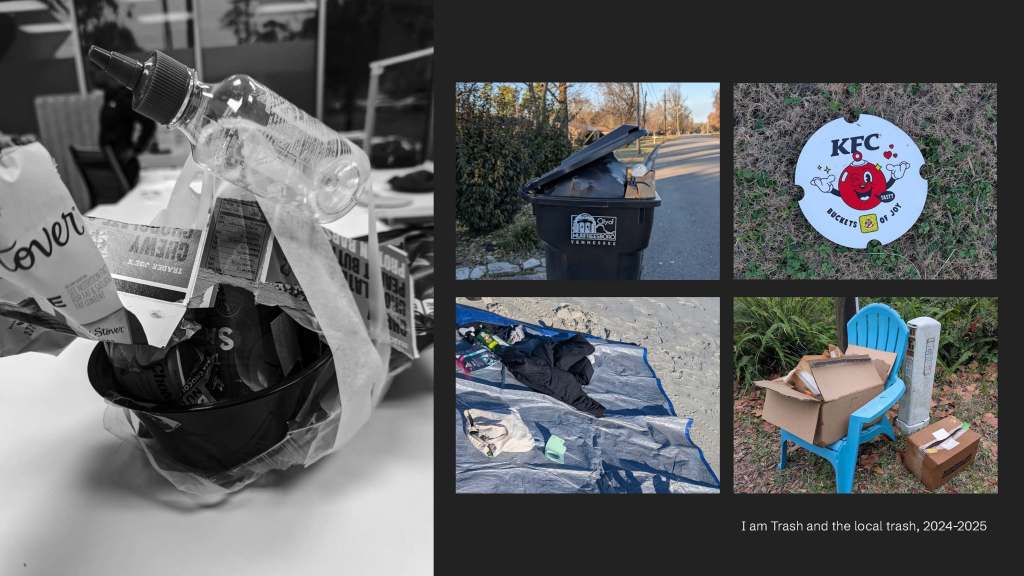
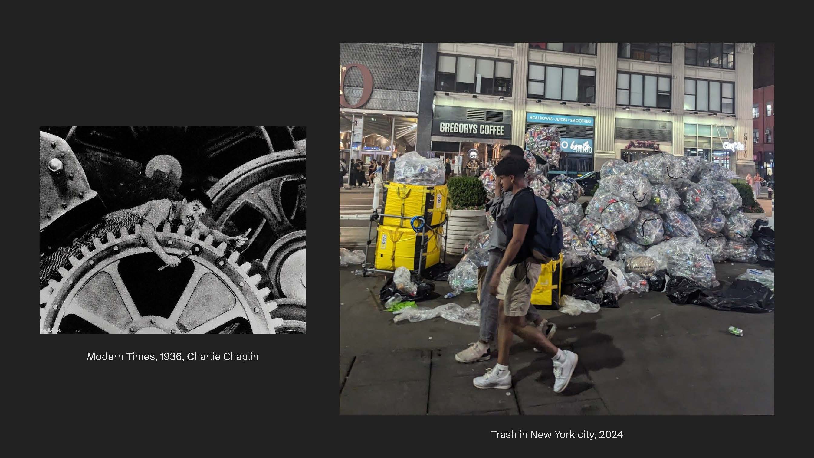
We often know that Adobe software is the powerful station in producing graphic design, but do we know where the graphics eventually go? This is a question that I learn to worry about, and I would like to share with you for this shared worry. It brings us to the question: how can we as (graphic) designers be responsible for the works that we produce which then become wasters? How can we be responsible for the risky visual (mis)representations of cultural products that are massively produced? That is when I became more critical and put together the production process besides its aftermath – the waste process. The clean machines in contrast with the chaotic trash which is in the middle of New York City, which is a very luxurious and diverse.
When a diversity of cultural products is produced and consumed, the aftermath is also a diversity of wastes. As graphic designers, we closely link to the industrialization process as well as the wasting process. So, for today’s activity, we will experiment with trash as a way to understand our role in the cycle of handiness as well as the relation between the design object and the design body, based on your consumed products – trash. This way, our design studio became a design space where epistemic object – the trash – is examined and discussed.
Okay, you might need to put away your laptops as always because we’ll get messy.
References:
- Bow, L. (2019). Racist cute: Caricature, kawaii-style, and the Asian thing. American Quarterly, 71(1), 29-58.
- Ewenstein, B., & Whyte, J. (2009). Knowledge practices in design: the role of visual representations asepistemic objects’. Organization studies, 30(1), 07-30.
- Mov-ie. “Modern Times (1936) Charles Chaplin, Paulette Goddard, Henry Bergman. Comedy.” Dailymotion, 17 Jan. 2016, http://www.dailymotion.com/video/x3mhpli.
- van Amstel, Frederick. “Sustainable Design.” Frederick van Amstel, 11 June 2019, fredvanamstel.com/teaching/sustainable-design. Accessed 2 Feb. 2025.
- –. “Designing as User.” Frederick van Amstel, January 27 2026, fredvanamstel.com/talks/designing-as-a-user. Accessed 2 Feb. 2025
- Van Amstel, Frederick M.C and Gonzatto, Rodrigo Freese. (2020) The Anthropophagic Studio: Towards a Critical Pedagogy for Interaction Design. Digital Creativity, 31(4), p. 259-283. DOI: https://doi.org/10.1080/14626268.2020.1802295
Acknowledgement: This lecture partly reflects the autoethnography method that I have been encouraged to study for my MFA thesis, where my graduate professors and colleagues have patiently and passionately hold conversations that I can be a part of.